

37 Examples of Color Psychology on Room Interiors
UPDATED Dec. 30th, 2019

Photo by FORMA Design

Psychology of Colors in Room Interiors
My interest in the psychology of color is rooted in my capacity as an artist as well as a business professional continuously studying and understanding effective communication – whether verbal, audible, or visual. In addition, my multicultural background and upbringing also drives my interest in understanding how colors are treated differently by various cultures around the world.
It goes without saying that the way you furnish, decorate, and color your interiors at home is part and parcel of who you are - your personality! Similarly, color choices made for commercial interiors reflect organizational values and goals. For many people, the color of the room walls doesn’t figure highly in their design choices even though it affects our mood, feelings, and thoughts on a daily basis.
“Emotional responses to color depend on their saturation and brightness, while cultures have association to particular hues,” explains Dr. Sally Augustin, a fellow at the American Psychological Association.
Because colors affect people in many ways, depending on age, gender, ethnicity, climate, etc., I’ve limited my discussion here to North American or Western ideas associated with each.
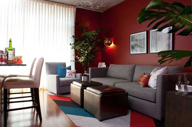
Photo by Shakoor Interiors

When painting and decorating, it’s critical to bear in mind that specific colors and their groupings drive similar reactions from most people; with variations in reaction stemming from saturation used, the particular tint or shade applied, and tone. This is why it’s so important to choose colors wisely when it comes to decorating.
Thinking about current color trends? Just keep in mind that trends are just that – transient preferences. They come and go. Your personality and character should be the main driving forces behind your color choices with current trends finding a fit in your home only if they jive with your personality.
In step with understanding your personality, understanding the psychological values of different colors and your historical associations with them, and the purpose of the room, will help you understand which colors are best suited for your interiors.
Let’s take a deeper look at interior colors and how they can influence your mood or thoughts.
Choose Wisely
Colors have psychological impact. Different colors influence emotions, ranging from peacefulness to excitement, or even anger. In order to bring peace and harmony in your home, choose your colors wisely; different amounts of various colors can have unintended effects on you and your family.
What mood do you want to create? Which colors will help you achieve that mood?
If you need help answering these questions, look at magazines, decorating books, blogs and websites for ideas. Also, let your textiles be your guide. Fabric, carpeting, furniture and tile are available in a more limited range of colors than paint, so choose them first and then decide on your paint color.
Once you find something you like, limit the number of colors in a room to no more than three or four. Too many colors can make a room look busy or cluttered. Paint is fairly inexpensive and transforms a room more quickly than anything else, so you can afford to experiment a little.
Colors and Their Impacts on the Room
Colors act in three basic ways: active, passive and neutral. You can easily match every room’s colors to your personal desires, to your taste and to the room’s purpose. Light colors are expansive and airy, making rooms seem larger and brighter. Dark colors are sophisticated and warm; they give large rooms a more intimate appearance.
Let’s take a closer look at colors and learn what they can do to a room.
Red: As a primal color, it can convey passion, excitement, danger, and more. It certainly gets your adrenaline flowing instantaneously and can easily stimulates energy levels of emotions – just be mindful of which emotions you’re stimulating relative to the purpose of the room.
In the dining room or kitchen, a medium shade of red is great for the walls to excite the appetite – which is why it’s often used in restaurants.

Photo by Chris Jovanelly Interior Design

In the living room, it can be used via wall décor or accessories to raise the energy levels of conversation which is great if you’re looking to have a lively mood when friends are over – but be careful not to overdo it; certain shades of red and crimson can also induce feelings of aggression or rage.
In the bedroom, it can be used to aid passion and romance, but it’s not a color you want to splash all over the bedroom walls as its intensity might keep your heart rate higher than desirable for falling asleep easily.
In the entryway or foyer, it can create a strong impact but use it sparingly if you live in a hot climate.

Photo by BLISS HTA

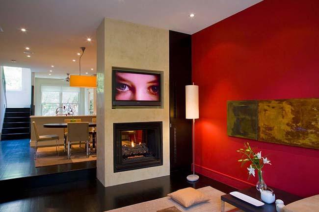
Home theater walls are also a popular destination for this color, albeit with darker shades ranging from dark red to burgundy, due to the prestigious association with traditional live theater colors that used drapes of the same color as well as wall paint. In this environment, dark red hues channel the feeling of exclusivity, of having a private viewing balcony at a famous theater for live arts. Make sure you use flat paint to prevent unnecessary reflections.
(Read our in-depth analysis of this color and more examples of red interiors here:
52 Examples of Red Interiors and Psychology.)
Worth noting here is that Pink is the only tint of a primary color (red) that has its own, globally recognized name, more than any other. Sure, you could mention other tints (or shades) of primary and secondary colors - like jade, aqua, lilac, etc. – but none of them are so universally used and immediately recognized as the word “pink”.
Photo by EDC Interiors, Inc.

Pink was once considered a masculine hue, with “baby blue” considered a feminine color – and this was all less than 100 years ago. And even to this day, in some areas across the Atlantic – particularly in France – pink is still used by many men in their interiors, as well as for accents or clothing items.

Photo by Morgan Horwath Photography
Here in North America, this tint is a color that is most often associated with feelings of romance or playfulness, and it has also been known to induce calm – once even being used at Iowa State University to paint the locker room of a visiting sports team in an attempt to make them too calm, to the advantage of the home team. "People who are in a space colored Pepto Bismol pink, in particular, become calmer, also known as the ‘pink effect,’” states Augustin. “This seems to continue for about 20 minutes.”

Photo by Martha O' Hara Interiors
Currently, pink is a strong color choice for many women and girls across North America, so I don’t hesitate to recommend it in rooms which see more use by the ladies of the house than the men – an ensuite bathroom in your daughter’s bedroom for example.
Orange: Similar to red, this energetic color evokes excitement and enthusiasm. Its warmth enhances enough energy to stimulate conversation and help people connect while sidestepping the blood-pressure raising effects of red.

Photo by Katia Rocchia

Photo by Merzbau Design Collective
In the living room or social areas, pair this color with browns or earthy tones to provide the kind of visual comfort that makes people want to get cozy and engage in long conversation.

Photo by Jonathan Clark Architects

Photo by BHaley Design+Build
This color also works in your home gym to provide the motivational impetus needed to hit your workout goals. No wonder it’s used so widely in sports and athletic brands. In the right amounts, it makes you feel alert and energized.
Yellow: Personally I love this color, but only for certain, limited applications or rooms. Yellow certainly channels sunshine, optimism, and happiness – when used in its lighter variants. Darker, saturated, or more intense shades of yellow can make people irritable and argumentative, and studies have shown it is also the color that makes babies cry more.

Photo by Acucraft Fireplaces

Photo by Andrew Mann Architecture
When used on an accent wall, it works great in kitchens that have plenty of sunlight – warming up the space on long winter days while being light and airy enough for the summertime.

Photo by Serrao Design / Architecture
In bathrooms, use a lighter tint paired with white to create a refreshing environment; add a tint of one other color to suit (perhaps lime-green, where it is energizing and uplifting. In smaller areas, entryways, halls, etc., the lightness of yellow can visually expand the space.
Green: This is regarded as the most restful color for the eye due to the association with spring, nature, and vegetation. It is also associated with fertility and wealth – a lush green rainforest or a thick verdant carpet across a large field indicates the presence of nourishing water. Green contains the calm and refreshing quality of blue and the cheerfulness of yellow, with various hues skewed towards either primary being used to channel more of that effect.

Photo by UL Studios
Increasing the yellow to achieve a lime-green color works well in the kitchen for example, lending a light and cheerful mood by channeling the springtime spirit (try pairing it with white and a dash of dark chocolate / rusty brown).

Photo by Michael Richman Interiors
In the bedroom, take the green closer to blue if painting your walls with it, and creating a tint or tone by adding a bit of white or gray respectively. This helps keep the bedroom environment softer on the eyes to help you rest easier in the evening when you’re winding down, while its association with fertility only adds to its value for the bedroom.
In the bathroom, take the green towards bluer variants to give your bathroom a more relaxed, spa-like feel. You can also color the walls with green tones while adding aqua blue accessories to achieve the same relaxing effect. The only word of caution I’ll toss in here is if you know green (and its variants) don’t look good on you, then don’t use that color in the bathroom directly opposite of the mirror.
In social areas such as dining or living rooms, green helps people to relax and unwind, it alleviates depression and anxiety, but has enough warmth to promote comfort and togetherness – vital for spaces where you want humans to connect and interact.

Photo by JLV Creative

Photo by BK Classic Collections Home Stagers
Your home office is also another area where green – and associated variants – can work its magic, primarily due to its ability to help you concentrate. One option to consider when thinking of green for your office is to have a “living” accent wall in your office: put up a trellis that covers one section of the wall and let a climbing plant grow all over it. I would recommend this option only for offices that have decent access to fresh air and sunshine.
Blue: By far, this is the most favorite color around the world in general. And no surprise, who doesn’t love looking at the blue sky on a nice summer day? It’s relaxing and calming. “Blues are known as the cool, soothing color,” says Jenna Pizzigati-Coppola, owner and founder of Pizzigati Designs. “It’s known to be conductive to aid in sleep and provide calmness.”

Photo by Domus Nova Real Estate
Blue is also the color that stimulates creativity – it’s often the color of choice in any space where people are encouraged to think and be creative, artistic, or otherwise innovative. Studies have shown that in scholastic environments, students exposed to blue prior to writing exams were more successful and achieved greater results.
(This ability of blue to inspire and drive creativity is also why I chose it to represent the Maverick & Blueberry brand.)
Caution should be used with blue during the winter season in colder climates. “Some blues can have a very cooling affect as they can turn chilly-looking when applied on a wall,” says Beverley Kruskol, owner of painting & construction company M.Y. Pacific Building, Inc.
In addition, too much blue can cause some people to get moody – particularly those who have seasonal affective depression (SAD). Personally, I advise those living in colder, Northern climates to change blue-oriented color schemes to warmer colors during the winter months to help address this challenge. Keep this in mind when looking at paint chips or color strips in the store – a light blue color can look great under the store lights, but if the room in your house doesn’t get a lot of sunlight or have otherwise copious amounts of warm lighting, it’ll get chilly and depressing pretty quick. Be sure to balance it with warmer fabrics and accessories.
Darker shades and tones of blue also communicate trust, tranquility, and peace. This is why it’s a great choice for bedrooms when toned down and paired with warm neutrals, helping provide a calm environment conducive to rest and sleep. All colors in general work better on large spaces such as entire walls when they’re bright but not too saturated, and the same goes for blue.

Photo by SARL TY MENO

Photo by R. Brant Design
For your home or commercial office, blue paired with green accents can work wonders – keeping the environment calm while also helping stimulate any tasks that require creativity or ingenuity.
The only room I strongly recommend avoiding blue for is the dining room – the color is known to suppress appetite, so if you’re looking to create an environment that helps you and others enjoy their food, avoid blue.

Photo by Kohler

Photo by Ogawa Fisher Architects
For bathrooms, blue is a wonderful choice because of its calming effect on blood pressure and the cardiovascular system. If you want then relaxing and serene effect of the spa, then consider using a range of hues from aqua to sky-blue, accented with white or warm-tone neutrals.
Purple: Ever wonder why purple was often associated with wealth, royalty, and power? Historically, purple was an extremely expensive color to produce – with some purple fabrics actually worth their weight in gold.
One of the earliest known origins of purple dye was from the ancient Mediterranean coastal city of Tyre, located in what is now the country of Lebanon. The dye was extracted from a small mollusk (murex brandaris) that was native only to the region of the Mediterranean Sea next to the city. Fabric producers and traders had to gather and press thousands of mollusks just to make one gram of Tyrian Purple.
Not surprisingly, the high cost of production meant that only the ruling class could afford to buy and wear it and thus, for many centuries it was synonymous with wealthy status. It was worn only by the imperial strata of ancient Rome, Egypt, and Persia and also by some clerics and high-priests, due to the ancient association of emperors and kings with God and religion.

Photo by MOD Construction Inc.
Another blunt and stark reason was Sumptuary Laws of Queen Elizabeth I, which regulated what colors, fabrics, and clothes could or couldn’t be used by the various classes within English society. Purple was forbidden for use by anyone except members of the royal family.
But enough of that.
Let’s fast forward to the present day in the 21st century where we all have the luxury of enjoying this rich color and its many tints, shades, and tones! Because of its historical association, purple is one efficient way of introducing an element of luxury into your home.

Photo by Équipe Mandrée Design
In its darkest shades – think of raisin, wine, or eggplant – this color can make any room feel rich and sophisticated, particularly with the right use of material (type of paint, wallpaper, or other substrate). Pair it with neighboring colors to add depth to your color scheme for the room, or with neutral tints of complementary colors to add visual interest while still imparting that luxurious feel – for example deep wine with champagne.

Photo by Soorikian Architecture
Lighter variants of purple, such as lavender, mulberry, or lilac can be used to bring the same calming experience to your interiors as blue, without the risk of feeling chilly thanks to the addition of red.
Using purple in bedrooms is best when applied with lighter tints or tones. If you want to use darker shades, consider using dark purple wainscot paneling against a lavender or mulberry colored wall, balanced with white or gray rugs, accessories, curtains, or wall décor.
Neutrals (black, gray, white and brown) are absolute staples of any interior decorator’s palette. It’s worth noting that while monochromatic environments can look amazing depending on what the base color is that you’re using, be careful of using all-neutral schemes based solely on white and beige: “White/beige spaces make us tense, moody. Testing in healthcare environments, where many rooms, particularly in surgical suites, have white/beige walls, floors, and ceilings, has determined that this color scheme upsets patients.” says Dr. Augustin.
White and beige combos aside, the value in monochromatic schemes is their versatility: throw in color to energize the room; remove color or desaturate it to introduce calm and tranquility. Much of this depends on other factors like purpose of the room, season, and so on – which I’ll discuss in depth in future posts.
White doesn’t have to mean bland, when used correctly. Many designers love working with it for its most obvious strength: helping a space look more open and airy. It’s also used in small or cramped spaces to give the illusion or larger area.
One of the recommendations I give to customers of Maverick & Blueberry is, depending on family and space usage dynamics, to consider actually using white as their base color; in the living room, a white rug coupled with a white leather sofa against a white wall may seem quite dull at first. But think of it as a flat white canvas – inject color using colorful sofa pillows, with a large statement piece on the wall behind the couch to add additional color. Continue the trend by adding vases, faux plants, or accessories that match the same color scheme. Use the season to determine the color scheme of the décor – go with lime-green and aqua, or green and brown, for an energizing springtime look.

Photo by Randy Artis via Ethan Allen
As the year slowly melts into summer, switch out the lime-green for light blue and brown against the white – colors that help keep the color temperature of the room cool. Replace the wall painting with another abstract piece that has similar schemes. As fall and winter arrive, consider using warmer tones such as orange and red interspersed with some yellow, or consider red and purple accented with gray or silver – all against the white backdrop.
You can use this same method for the bedroom, or even dining room. Treat the white furniture and walls as your “base” canvas, and liberally splash colors all around according to room purpose or season using a combination of wall décor, cushions and pillows, rugs, and accessories.
Brown is a color I recommend for creating rich, cozy, and enclosed experiences. The feeling we get from chocolate, mocha, coffee, and many other tints and shades is one of safe and snug spaces. Why? Brown is a color that reminds us of nature and of earth. The ground, the soil, trees, and more. All of these help stabilize and reassure us. Think of the color as a strong anchor, one that is safely grounding us, keeping us down-to-earth – all concepts that describe being safe on level ground.

Photo by Pepe Calderin Design

Photo by Anthony Michael Interior Design, Ltd.
Depending on the color scheme, materials, and purpose of the room, you can use this amazing color to add sophistication and luxury to your interiors. Mahogany or dark chocolate can create rich interiors suited for deep and quiet conversation such as in a den or a library.

Photo by Corsini Stark Architects
Use a lighter version of brown such as caramel, paired with white and blue shades for that oceanside, nautical look that works great for small spaces such as bathrooms or laundry areas.
Gray adds elegant sophistication to any color scheme, period. You can take any color scheme that contains white plus a strong saturated color and add silver or gray to instantly impart an understated level of calm confidence into the entire room.

Photo by ZR-Architects

Photo by Jane Lockhart Interior Design
A darker gray also works well when paired with heavier shades of neutrals, or dark floors to impart a more solemn or structured feel to any room where you may want to maintain formality of behavior or purpose.

Photo by Michael Abrams Limited
But as mentioned with the all-neutral warning, be mindful of large, unbroken swathes of gray paired up with other neutrals in the same saturation – it can become quite dull or depressing. Use gray or silver to make other colors pop instead of becoming a near-homogenous muddle.
Black is not for the faint of heart. For starters, it is best used in small doses as an accent.

Photo by Jane Lockhart Design
There are some personalities that can pull off certain rooms that are largely black, but this also depends on variables such as materials used, gloss or matte finish, etc. I’ve spoken to several professionals who also feel strongly that every room needs a splash of black to ground the color scheme and give it depth, and I agree.

Photo by Maverick & Blueberry
That was the thinking behind our Tratti Nero series – a gallery of stark black & white prints that you can use to introduce a strong dash of black without the need to repaint.

Photo by Rosewood Custom Builders
Unsure of going completely pitch black on a wall, or certain accessories or accents in your room? Consider using small doses of super-saturated shades of the base color. Is your dining room using red as the base color? Consider using very dark red wine, or super dark mahogany for small streaks or touches here and there – perhaps a vase, or the frame of a mirror, etc. in lieu of black.

Photo by Jane Lockhart Design
When black is used as an accent wall, consider applying a tone-on-black pattern or using a texture, to add significant interest and make it feel both more luxurious and mysterious while removing that imposing, dreadful edge.
What About Ceiling Color?
This is definitely an area of the room that gets much neglect. Folks, it’s a full one-sixth of the space in your room, so please give it some more thought than just a drab coat of white paint.
Generally speaking, if you want to give the impression of a higher ceiling, then paint it lighter than your walls. If you want to make it feel more cozy or lower, then consider a darker shade than the walls. This doesn’t mean claustrophobic: visually lowered ceilings can evoke intimacy without triggering feelings of anxiety due to small, enclosed spaces. Just bear in mind the general rule: dark walls make a room seem smaller, and light walls make a room seem larger – the same applies to horizontal surfaces.
One room in the house where many folks do indeed paint the ceiling a flat black color is – not surprisingly – the home theater. The idea is to enhance the viewing experience and mitigate or remove other distractions, such as undesirable reflections. Hence, many will opt for a flat black paint on the ceiling that absorbs reflections, providing a more enjoyable experience.
These are just suggested launchpoints in your exploration on what interior colors will best align with who you are, and what you envision in your home. Stay true to who you are – after all, you’re the one living in your home, and it needs to be your everything – safe, calming, creative, exciting, soothing, etc.
Happy decorating!
Like what you just read? Sharing is caring!
-
Sal Ziauddin
Comments on this post (7)
Hi maverickblueberry.com owner, Thanks for the well-researched post!
— Raymundo Tatum
Dear maverickblueberry.com administrator, Your posts are always informative and well-explained.
— Keeley Arevalo
So, my entire upbringing, I lived in a extremely colorful home. My mom and I would always repaint the walls what seemed like all the time. Every few months, one of the rooms in our house would change colors. That may be a bit of an exageration but seriously – we had a yellow kitchen, purple rooms, blue bathrooms, yellow livingroom, etc. My room had seen a few colors – I started my young years with bubblegum pink, then to a lavender purple with a vera bradley comforter as I passed through my middle school years then finally, to faded electric blue walls with a white comforter, and a white pillow that said BEACH in the same color letters accompainied by a red-headed mermaid. All of these colors had a different styles and made me feel different things. Since moving out of my childhood home, I have lived in a college dorm, ZTA house, an off campus duplex and an off campus apartment. All of lacked color. Thinking back on my college rooms and the dissastifcation with each and every one of them have led me to conclude that the colors in my room played a big part in my overall comfortability and satisfaction with life.
With a lot of thought, I have discovered white walls and lack of color drives me absolutely mad. It just feels like your stuck in a box. An extremely isolated, cold, dull box might i add.Just think for a second – Can you imagine the difference in your mood if somebody put you in a yellow box for an hour vs a black??
Huge difference.
Colors make you feel something and THAT is why it is so important to paint your walls.
Just tonight, I had tried to convince my mother (who moved into a new house after I had left for college) that we needed to paint the walls in her house. She wants to put in white walls to brighten up our wood pannels in our home but I think shes fogetting that she loves to have a colorful house?
I suggested we paint a sage green wall because the couch in our living room is gray and I think it would go together very well.
Maybe add some plants to liven it up a bit?
I just sent her the picture of the room with a pink accented wall. I doubt shed want to do that but I might in my future apartment.
Anyways, I know that was pretty all over the place but thats what led me to your article. It was a great read and much appreciated! Good work.
— Madeleine Gallier
I enjoyed and agreed with much of what I read. I learned a lot, too. I really appreciated the photos. That helped a lot. Thanks for this great article.
— Pamela S
I found this very helpful. Thanks
— Mercy
Thanks Pam! This was our starting piece for the psychology of color on interior walls. Our follow-up posts will deal with how individual colors are perceived and used across the world.
Stay tuned.
— Sal Ziauddin
I found this very interesting- especially the comment on what gray does for a room. Adds sophistication. Also calm confidence! I never thought about this. Loved the accents of yellow with the neutral light airy room wirh gray furniture … very stunning.
— Pam Foster